

To do a quick comparison of the evolution of organic positioning or ad multiple domains, SEMrush provides a comparative graph which can be accessed from the menu on the left and top, in the Tools section, selecting the graphics link. You can also access this chart if you click on the trend graph on the main report for domain.
Try SEMrush with 10 extra requests
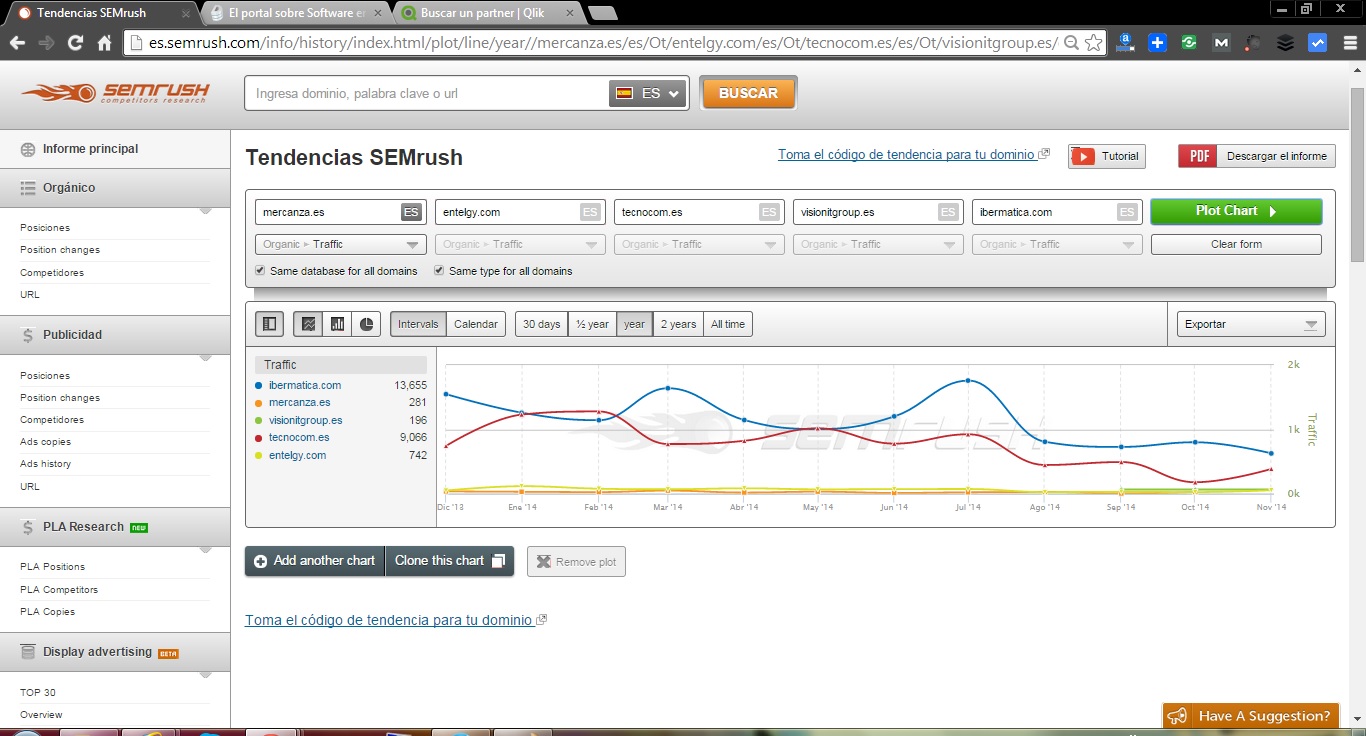
This utility allows you to compare several chart types and for different time intervals trends positioning of up to 5 domains, allowing selected for each indicator to be analyzed.
Available indicators are: Total Keywords, Traffic, Traffic Price, New Keywords, Keywords Lost, Improved Keywords, Keywords Declined. Each indicator has a version that refers to the organic positioning and another version that refers to the positioning paid Adwords ads.
If you want to compare more than five domains, you can create a chart, and you can even get the code to insert traffic on another website.
The best thing about this tool is that it is free, it is not necessary to have a subscription to SEMrush to use.
Try SEMrush with 10 extra requests
