

Data has become a central asset to organizations and visualizations are critical to present data in a clear way. Visualization helps organizations make data-driven decisions. Optimizing data visualizations conveys the information in an accessible way that enhances the user experience. This article provides seven practices you can follow to improve your data visualization process.
What Is Data Visualization?
The term data visualization refers to the graphical representation of data. Users can see and understand the data through visual elements by using data visualization tools. Examples of data visualizations include charts, maps, and graphs.
Visualizations have proliferated as a popular way to transmit information. The Internet is full of infographics, charts, and visuals. According to a report from Infographic World, people retain information longer if the content includes visuals. Therefore, optimizing the visualizations for web usage is a necessity.
A chart tells us a visual story. Data visualization can help you convey a message through visual storytelling. This is especially important when working with big data. Data scientists use visualizations to extract valuable insights from complex and large datasets. Because of the large and distributed nature of big data, it is critical to refine and present the data in a way that can be easily understood.
What Is Image Optimization and Why It’s Important
Data visualizations usually consists of high-quality images. Such images tend to be large, slowing the page load time. This has a negative impact on the user experience. Research by Google shows that users tend to leave pages that take longer than five seconds to load.
When preparing charts for visualizations it is important to take into account image file formats. The right file format can help you achieve a balance between quality and size.
There are many image file formats, each with its own strengths and weaknesses. You can roughly categorize image file formats into bitmaps and vectors:
- Bitmap images consist of pixels—points that represent colors in an image. The more bits an image has, the higher the resolution. The most popular bitmap format is JPG. This format supports a wide range of colors and detailed images.
- Vector graphics consist of lines—enables users to enlarge images without losing quality. The most popular vector image format is Scalable Vector Graphics. SVGs are used mostly for sharp linear designs and online content.
Here are two methods you can use to optimize images for web usage:
- Resizing—reduce the size of the image by editing pixels. Usually, this involves adjusting the length and height of the image. However, reducing the number of pixels in an image degrades it. Achieving the right balance of size and resolution can be achieved manually or by using image editors.
- Compressing—reduce the size of an image by compressing the file. Image compression tools remove redundant data from the image, and merging pixels. While compression can effectively reduce the size of the file, it affects the image resolution. Manual image compression requires technical skills, but some image compression tools can automate the process, making it easier for users.
Tips to Optimize Data Visualizations
In order to ensure your data visualizations are optimized for web, there are a number of best practices you can follow.
1. Keep it simple
When trying to tell a visual story, less is more. A cluttered visualization can confuse the user. It is important to work with a set color palette. Keeping the colors contrasting enables the user to know where to look first. In addition, you should choose the visualization type that conveys the message in the simplest way. Some visualization types, like 3D Charts, don’t display well in small devices.
2. Sort and clean the data
Before choosing a data visualization type you should ensure the data is clean of duplicated and faulty records. A data wash and rinse procedure can help you get rid of potentially confusing records. Sorting the data can help users follow the story better. You can sort the data hierarchically or according to other criteria.
3. Use formatting
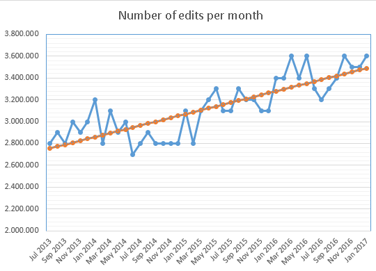
When using simple visualization types you can play with formatting types, such as trendlines. Trendlines help you make the pattern obvious to the user. These lines can also help you detect trends and predict outcomes.

4. Make images responsive
Users expect to properly understand the data regardless of the device they use. Data visualizations need to be accessible on desktop and mobile devices. To achieve that, you should ensure your visualization is responsive—the image and layout automatically adapts to the target screen. You can learn how to make your images responsive from a number of online tutorials, or by using optimization tools that do it automatically.
5. Use hierarchy to prioritize data
You can simplify the look of complex data by using hierarchy. Adding a hierarchy to the data helps prioritize and guide the user through the data journey. For example, you can prioritize showing the total sales by branch and then add details by sales representative. That way the user can see the most important data first.
6. Use captions and alternative text
Accessibility ensures all types of users can access your data visualization. You can add alternative text, which is a short description of an image hidden in the backend code. Accessibility readers “read” the alternative text to visually impaired users. Search engines also use image captions and alt text to search for images.
7. Include comparisons
Comparisons can be useful when you try to represent data in visual forms. Adding a comparison between two variables adds insight and guides the user to the message you want to convey. For example, if you are trying to showcase growth in sales, you can include a comparison with the previous year.
Wrap Up
Effective data visualization tells the story behind the data. Data visualization is becoming increasingly popular, with visual content taking central stage. It provides an easy, clear way to explain complex data to users. Leveraging best practices and tools for data visualization can increase the impact of your visual storytelling.
Author Bio

Gilad David Maayan is a technology writer who has worked with over 150 technology companies including SAP, Samsung NEXT, NetApp and Imperva, producing technical and thought leadership content that elucidates technical solutions for developers and IT leadership.
LinkedIn: https://www.linkedin.com/in/giladdavidmaayan/
