
Which parent has never had to face this question? The idea of creating an interactive dashboard comparing the nutritive values of a BigMac against other foods came when replying for the 100th times to this question. Here is the result accessible from your PC/iPad
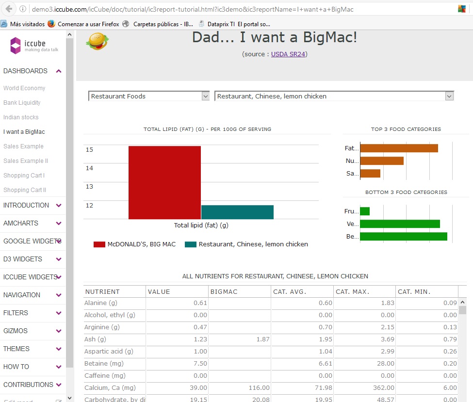
This dashboard is comparing the nutrient (e.g., fats, sugars, vitamins, etc...) contained in a BigMac against other typical foods (e.g., vegetables, snacks, etc...) and put them in perspective against top (and bottom) three food categories.
Data & Multidimensional Model
The United States Department Of Agriculture is providing detailed information about the nutrient composition of several foods from which two dimensions have been created:
-
the foods arranged within several categories (e.g., vegetables, fast-food, etc…),
-
the nutrient list (e.g., fats, cholesterol, sugars, salt, etc.).
The Dashboard
Creating a dashboard using the icCube graphical Web interface is about assembling and linking altogether several widgets (e.g., filters, graphs, pivot-tables, etc...). Note that once published, this dashboard remains editable at any time for a collaborative work.
The definition of a filter selecting a food category is about choosing the members of the [Food] dimension. Then an event of selection is declared to link this filter with other filters and graphs (e.g., top 3 categories):
The same way, here is how to generate the list of the top 3 categories for the selected nutrient:
The graphical interface allows for defining as well the position, the size and all the other graphical properties of the different components. But keeping in mind that those dashboards are eventually published on the Web, this tool is directly exposing Web features that will please the most demanding and advanced users:
- direct access to the CSS to adapt your corporate styles,
- Javascript code injection for fine tuning,
- tight integration of each widget in existing Web pages,
- tight integration of external libraries for advanced charting capabilities (e.g, D3.js).
This makes this tool an ideal candidate to integrate your dashboards within an existing SaaS solution. Following the same idea, direct and full access to MDX allows for performing ad-hoc and complex analysis (notice the min., max formulas for each food category).
Conclusion
I look like quite serious now when showing to my daughter a Web page detailing the high level of fats in the BigMac as well as the quantity of sugar in her breakfast cereals. Although, as long as this is not available in Facebook I’ve no chance to convince her.
More seriously, this example is demonstrating that it is possible to setup and publish attractive and interactive dashboards on the Web in a very short amount of time. Those dashboards allowing us to take informed decisions at any time.
The 100% Web architecture as well the solid underlying multidimensional model (in-memory OLAP/MDX) are strong foundations to develop more complex dashboards and analyses. For example, it would be interesting to integrate both historical nutrient data and public health data to show the evolution over time and determine some correlation if any.
We are inviting you to explore more in details icCube dashboards using our live presentation here.
Your feedback is highly appreciated.
