

Data visualization describes techniques and tools that help people understand the meaning of data by representing it in a visual context. It’s often easier to identify important trends, correlations, and patterns in data which is presented visually rather than in its native format. Data visualization is particularly helpful in a Big Data landscape, in which many enterprises try to derive insights from huge data sets, with information obtained from myriad sources, including social media, enterprise software, and web analytics.

Forbes reported in 2017 that 53 percent of companies have adopted Big Data analytics, which is a significant increase from the 17 percent figure reported in 2015. This figure can be expected to further increase over the coming years, meaning Big Data and data visualization will only grow in relevance as companies look to make all this data more accessible and understandable.
Read on to find out how data visualization is linked to another extremely relevant aspect of technology—responsive web design and responsive images.
Responsive Web Design
Responsive web design refers to a design approach that attempts to ensure websites are optimized for viewing and navigation across a range of different devices. Statcounter reported in November 2016 that mobile and tablet internet traffic exceeded desktop traffic for the first time. This statistic confirmed what many web designers had known for some time—designing websites with only desktop and laptop screens in mind is not sufficient; websites must adapt to screens of all sizes to provide an optimal experience.
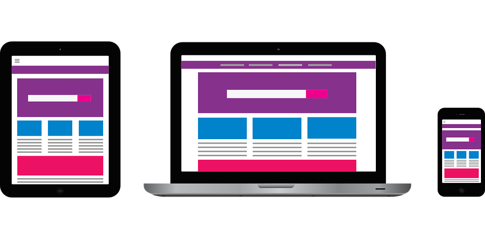
Responsive images, in particular, are a pivotal aspect of responsive web design. Images are fundamental for helping to engage visitors with website content, and the range of devices used to browse modern websites means that the pictures must adjust on-the-fly to suit the specific devices used to view them.
Responsive images don’t just resize their dimensions to fit a user’s screen; responsive images must also adapt their quality to various devices resolutions. Otherwise, many users would waste lots of bandwidth loading high-quality image data that they cannot even use.
Responsive Design & Data Visualization
As organizations gather all this Big Data from many sources, they are figuring out that they can use such data to tell stories on their websites or to enhance their functionalities. After all, interesting data presented visually can lend credence to any story and strengthen how well that story resonates among website visitors. Aside from complementing on-page stories and even creating meaning for people, data visualization can be implemented, for example, to provide real-time information for transport services.
In the not-too-distant past, the only method for conveying data on a website was in a static image format by showing tabulated data in charts, graphs, etc. However, as time passed, better technologies became available, including scalable vector graphics (SVG), which allow web designers to display interactive data visualizations in a lightweight manner, in line with the idea of responsive web design. Moreover, AJAX techniques enable designers and developers to create dynamic pages with charts and visualizations that update without reloading the page.
In fact, you can view data visualization as a subset of responsive design in which the same design principles used for displaying images that adjust to displays can also be used to derive meaning from large datasets and tell stories to people.
Modern responsive design revolves around the idea of progressive enhancement—building web pages first for users with a mobile phone, limited functionality, and a slow internet connection, before enhancing for more advanced use cases. Responsive data visualization is similar, except that the browser is regarded as the base user, in what UI engineer Bill Hinderman calls an “API-first” approach.
The idea is that designers can take raw data, parse that data into organized subsets, use APIs to output organized data in a particular format, and code HTML markup that constructs a visual representation of the data. The API describes the expected inputs and outputs of interacting
with large data sets. Designers often D3.js to produce dynamic, interactive data visualizations in web browsers using a combination of SVG, HTML5, and CSS standards.
Responsiveness can then be coded into data visualizations in the normal way by starting with an aesthetically pleasing default for the smallest screen. Scalable elements that grow with screen size feature prominently.
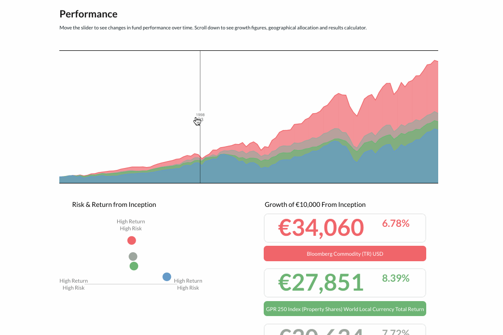
Responsive data visualization can achieve impressive results, including visualizations such as the above in which users can manipulate a slider to view different patterns and trends in data. This is particularly good for Big Data sets from which individuals can derive their own personal meaning in an interactive and intuitive way.
Closing Thoughts
Responsive web design has changed the way people interact with websites and web applications. Big Data and data visualizations have provided a whole new subset of responsive design to focus on, allowing designers to ensure content stands out on websites and enabling users to derive meaning from large stores of data, regardless of their device.
With an API-first approach, designers can ensure data is always available. Good Big Data visualizations involve layering, with a focus on the most meaningful information in the display while leveraging interactive techniques to enable users to view large data stores more granularly. Expect to see more websites using data visualizations as enterprises increasingly look for ways to make use of all the data they are inundated with daily.
